

Author: Brendan Kwan
Rent, Opera, Scenes from a Latin Quarter by Brendan Kwan
The chapter about Mademoiselle Munette in “Scenes from a Latin Quarter” paints a picture of life in the Latin Quarter, full of both energy and struggle. Artists like Munette face a mix of joy and hardship, but she remains passionate and dedicated to her craft despite the challenges. The chapter shows how her life mirrors the broader struggles of the area, where art and community are key to survival. It celebrates the human spirit and the power of art to create meaning, even in difficult times. The movie “Rent” really spoke to me. It was about a group of friends in New York dealing with love, loss, and challenges like poverty and illness. The songs make their emotions so real, especially “Seasons of Love,” which is about measuring life through love, not time. It reminded me to live fully and cherish what’s most important. It reminded me of Professor Gianoulis’ class, because we discussed gratitude and the importance of showing appreciation in our lives. One opera piece that I liked from the zoom recording, was “Ombra mai fu”. “Ombra mai fu” feels completely different from the other two. It’s a calm, beautiful song where a character sings to a tree and appreciates its shade and stillness. It was so peaceful that it felt as if time stopped for a moment. Unlike the intense emotions in “Rent” or the “Scenes from a Latin Quarter”, this opera piece made me think about how important it is to slow down and notice the little things such as the beauty of nature that I feel that we often take for granted.
Punk Rock
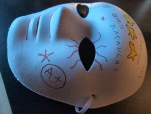
The guest speaker’s introduction to punk rock was an important part of his early life. It began when his uncle and aunt took him to a show during his childhood. That experience inspired Rich to create zines, which included band reviews and lyrics. These zines showcased musicians’ work to others. After attending his first punk rock show in Connecticut, Rich connected with people through his zines and eventually decided to form a band with some of them. He noted that most of the audience at these shows were men, with women often participating as photographers. I thought it was very intriguing
Hearing about Rich’s punk rock journey inspired me to learn more about the genre. Punk rock challenged the expectations of its time and eventually became so influential that those rules faded away. Looking at the old album covers passed around during class, I found myself drawn to the designs and the CDs inside them. It made me think about how people accessed music in the 20th century, before apps made it so easy to buy songs. I really liked the pins and stickers he gave me.
Graffiti

The Woman Who Gave Birth to Rabbits by Brendan Kwan
When I initially read the play “The Woman Who Gave Birth to Rabbits” by Stephen Gracia, I found it hard to understand and one of the most bizarre things I have ever read in my entire life. A woman. Giving birth. To rabbits. It was so gruesome, yet interesting. I could not help but read more and more. The ending was so weird too. She was praying to the rabbit gods to give her a rabbit because she felt mistreated. The message of the story was very inspirational and wise. When the actors and actresses read the play out and acted their roles, it made the play come to life. The screams, the emotions, they were all so vivid. I found it enjoying and helpful to picture the play. What I found most interesting was that out of the six panelists acting out the play, only one or two of them were actually actors, while the other panelists had other day jobs. The play was even cooler after I found out that it was based on a true story and it changed the way that I thought about the play. Meeting the playwright was also a very intriguing time. I really liked the way everyone showed different personalities and I really liked the experience overall.
Night at the Museum by Brendan Kwan
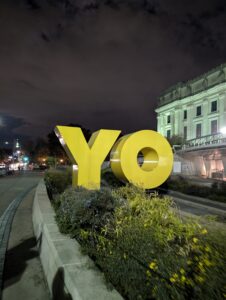
When I first arrived at the Brooklyn Museum, I saw a big YO sculpture.
I was eager to see what other surprises might ensue. The moment I stepped into the museum, I saw two ginormous statues of what appeared to be KAWS.

All of the Macaulay students then went to the auditorium to listen to the guest speakers. We were discussing the purpose of a museum and what makes a museum a museum. I found these questions to be very existential and possessing a deep meaning.
When I went to the fifth floor, I saw a really colorful painting consisting of a man and a woman arm wrestling. I really liked the colors of the painting and the message really stood out to me, because I identify with the AAPI community and I found the oppression and struggles in this painting to be incredibly powerful. It reminded me of the one war artwork saying “woman can do it too.” I really liked this piece of art. It is honestly one of the most immaculate pieces of art I have seen with my own eyes, and I think that it should be universally considered pulchritudinous.

Overall, this experience was amazing. I would recommend this to everybody. It was truly one of the best Macaulay experiences so far.
The Counter play experience
Brendan Kwan
23 September, 2024
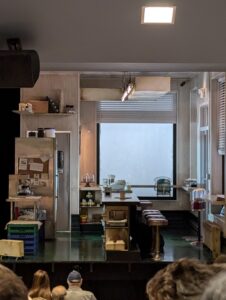
My day started off with me eating a small, modest breakfast sandwich. I brushed my teeth, got dressed, and went to the ferry. I met up with my friends at Empire Outlets and we took the ferry with our other classmates. When we arrived in Manhattan, I second guessed myself and missed the train with everybody in it, prompting me to take the next train that came around five minutes after. When I got off the train, I attempted to use Google Maps to get to the theater, but it caused me to run for twenty minutes in the wrong direction. I then asked a kind gentleman for directions and he told me where to go and I finally arrived at the theater after fifteen strenuous minutes. The play consisted of 2 main characters: Paul and Katie. Katie was a waitress and Paul was an ex-alcoholic. Paul talks about his obsession with Sophia Loren and Italian tape recordings. Paul wanted Katie to poison him. Katie did not want to poison him, because she would go to jail for murder. Both characters went through tough times, Paul being an ex-alcoholic and Katie moving and dodging twenty seven voicemail messages. They hugged and she went to find her mystery voicemail man. The play was pretty good, but to be honest, it did not feel short at all. The seconds felt like minutes and the minutes felt like hours, but I think that was partially due to the fact that I tired myself out while trying to get to the theater. Overall, I really liked the set of the play and it was a great first play to watch.
Art Lab at Snug Harbor
Brendan Kwan
14 September, 2024
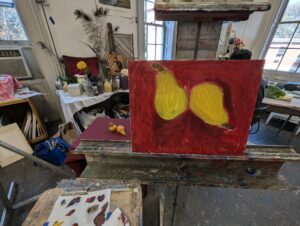
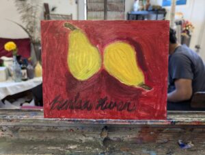
My friends and I decided to go to the Art Lab at Snug Harbor. We decided to participate in the Oil Painting segment. We met a nice artist named Griselda. She taught us how to utilize our eyes in order to fully understand the dimensions and of the object we are trying to draw. The object that I had to draw was a pair of pears. At first, I thought my art piece was going to be horrible just from the outline. As it came together, I stopped comparing my pair of pears to other people’s pairs of pears and started to really focus on my art, and surely enough, it became a masterpiece in my eyes. I began to mix colors in order to get somewhat identical colors as the real pears. I then focused on the background of the pears. Following that, I started mixing colors in order to make shadows for the pears. I was really surprised by how nice my pears turned out. Finally, when all was said and done, I signed my piece with a fine tip brush, giving it nice, slow strokes in order to write it neatly. The main lesson I learned during this art lab, is that even if you do not have much experience with art, anything is really possible
Brendan Kwan – Vietnam War
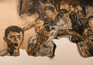
This art by Leon Golub titled, “Vietnam II” (1973) stood for the strong popular position of being against the Vietnam War. The Vietnam war enlisted millions of Americans in the draft and hundreds of thousands of Americans died due to the tactical and witty guerrilla warfare employed by the Vietnamese. This piece of art is important because it symbolized a time where the United States of America was fighting a war that was very unpopular with its people. America right now is fighting wars that are very unpopular with its people, therefore this art piece is highly relevant.
Trip to the Rubin Museum of Art by Brendan Kwan
INTRODUCTION:
To begin, my friends and I traveled to a magical art museum called the Rubin. I was excited to see what awaited me and what surprises I might find, because it was my first time going to an art museum in my entire life. All I could think of was six floors of wonders, waiting to be discovered.
EXHIBIT #1:
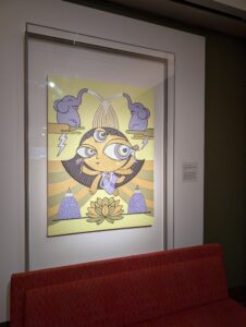
I genuinely enjoyed this piece of art. The colors are so vibrant and the style is familiar. The piece shown above was titled “Kamala”, a part of a collection called “Dus Mahavidyas” (Great Goddesses of Wisdom) by artist Shraddha Shrestha. What I really liked about this piece, was that it instantly reminded me of this cartoon I used to watch as a kid called “The Powerpuff Girls”. This specific piece made me think of Buttercup. It invoked nostalgic feelings inside me, which is a feeling I appreciate deeply. To be honest, I was not really that surprised to find out that the artist was inspired by Powerpuff Girls and other cartoons, because they look almost identical in style.
EXHIBIT #2:
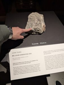
This piece of art shown above was by far one of the worst pieces of art that I have ever seen. The piece was titled “Divine Generation”. It was quite literally a rock dated from last year. One positive thing I could say about the rock is that the museum allowed us to touch it. It didn’t seem like it carried much meaning and it didn’t have any redeeming qualities.
EXHIBIT #3:
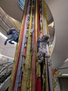
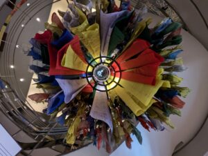
This exhibit shown above was titled “Asha Kama Wangdi, Vast Bhutan” or “The Windhorse (Lungta)” and it was one of the coolest things I have ever seen in person. It consisted of discarded prayer flags made of polyester and the artist turned it into a really nice collage with elegant designs. My favorite part of the prayer flag display was the horses that popped out. I was very fascinated with this art piece and the way it extended from the first floor all the way to the sixth floor. Every time that I made my way up the stairs, I would continue to look at the prayer flag structure, strictly because I was getting a unique perspective every step of the way.
CONCLUSION:
To summarize, I enjoyed the trip to the Rubin. I appreciated most of the art, especially the detailed arts on textiles. I thought deeply about the hard work that went to the textile arts, as well as the many sculptures that I thought were really cool.