Posts

Danil Gurshumov – AntiWar


What Happened to Protest Art?

This art has a very strong meaning. It sends a message that people should become more peaceful and that all wars should stop. The artist probably made this because they know that usually nothing good comes out of war. This is important because it shows how there are a lot of useless wars right now or wars for the wrong reasons. It has gotten so bad that the artist decided to make protest art about it. This piece of art resonates with me because I believe that wars should not be started for the wrong reasons. Of course there are some wars that need to be fought. For example, World War Two. In my opinion, if Germany was not stopped, they would keep fighting until they conquered the whole world. This is one of the mandatory wars that must be fought. Most wars do not have to be fought out, and they should look for more peaceful ways to resolve them, like through debates and talks. I say this because, at the end of the day, a human life is worth a lot.

Shahad Hossain – Berlin Wall Protest Art

This photograph showcases a painting on the Berlin Wall titled “My God, Help me To Survive this Deadly Love” and it is a famous piece of graffiti by Dmitri Vrubel. The mural depicts a real-life moment from 1979 when the two Soviet leaders (USSR, & East Germany) kissed, which was a customary greeting to show a strong bond and affection between the communist leaders. This artist wanted to reflect the oppressive and strained nature of the Soviet-East German relationship, diguished as a partnership. This painting was painted shortly after the fall of the Berlin wall, symbolizing the end of the cold war; however, more modernly it captures the deep contradictions in political relationships, where the surface-level unity often hides the deeper forms of oppression and control. This artwork remains one of the most iconic symbols of Berlin and the reunification of Germany which, draws thousands of vistors today.

Political / Protest Art – Amanda Alencastro

                                              (Barry Scanlan for Art to Change the World)

This purpose of this image is to convey how large businesses and corporations disregard environmental consequences of their actions in order to extend their wealth and control. This piece of art is quite current (2018?) and its message is still significant as this is still a prominent issue. It is important for us as a society to acknowledge the importance of preserving the state of our planet as it is essential to our survival and our future. It is true that many companies and individuals who are in charge of these companies are motivated by their desire for money and power, with little to no care about how some factors of their operations (ex: high carbon footprints) impact the condition of the planet, environment, and climate. This resonates especially now because it emphasizes how people are so focused on becoming more affluent that they do not see the increasing negative impact they may have on our world.


Brendan Kwan – Vietnam War

This art by Leon Golub titled, “Vietnam II” (1973) stood for the strong popular position of being against the Vietnam War. The Vietnam war enlisted millions of Americans in the draft and hundreds of thousands of Americans died due to the tactical and witty guerrilla warfare employed by the Vietnamese. This piece of art is important because it symbolized a time where the United States of America was fighting a war that was very unpopular with its people. America right now is fighting wars that are very unpopular with its people, therefore this art piece is highly relevant.

Protest art

This painting is known as the Pyramid Of Capitalism, and it was made to show the evils of capitalism. They show the disparity that the economy breeds and how the lower classes often have to do the hard work for the upper classes. The pyramid is reminiscent of feudalism in Europe, with the top benefiting from the people below, creating a system of the rich becoming richer. It was made for industrial workers and reminding the upper classes that America runs off the working class, and if they ever stopped working, the whole system would topple onto itself. It would later be used by the Soviets as a criticism against Capitalism.

Although I do not agree with the later uses of the painting, I do think that the painting itself brings up a great point about Capitalism. This point being that the upper class relies on the lower classes. Birth and status have a big factor in where you start in America, but what I think the painting fails to mention is the class mobility that does happen in America. Even though the class mobility in America is on the rarer side, it is not completely uncommon and with the right amount of work, and luck, people can climb on the classes to be on the top.


Protest Art Niko

This photograph is protest art from the prohibition era. It was meant to show how government oppression would be met with resistance. It was extremely important as the prohibition era led to a surge of protest through the illegal sale of alcohol. It resonates now as government oppression is always a prevalent topic. It can also connect to the recent efforts for state governments to ban/unban the use of things like cannabis. The main discussions with those arguments also relate to the same points made during the prohibition era, to some extent.

Protest art

This piece by Mr. Brainwash makes Albert Einstein the center of the piece, a man who is widely considered as the smartest man ever. In a time of such divide and hatred, love truly is the answer, and Albert Einstein is someone who we look to for the correct answers. If everyone just loved each other there wouldn’t be racism, homophobia, etc… There is a lack of love in society today which causes such a great divide in our everyday lives and throughout history. The background of the image uses art from various time periods to bring about unity, and also uses bright colors to be appealing to an audience, and for me, I associate bright colors with optimism. Everyone needs love, and it creates such a feeling of happiness when you receive it, illustrating Mickey in the picture, also having him towards the center is a great representation of love as Mickey was caring, kind, and always had open arms to his friends and strangers. The simplicity of this piece is also the beauty, as it speaks such loud volumes with just a few words, and art.

A Strange Trip to the Guggenheim

My experience at the Solomon R. Guggenheim Museum was not what I expected. I first researched the museum and saw it has twentieth-century modern and contemporary art. Truthfully, I do not know what that entails, but I assumed there would be some pretty landscape paintings I could look at and take a picture of. I could have chosen the common options of the MOMA, the Rubin, or the Whitney, but I wanted to visit a museum that many of my peers did not go to and discover something new.

Upon entering the museum, the first thing I noticed was the architecture of the building, which was more interesting than some of the displays and exhibits. From the outside, it looks like a rotunda, and inside of the museum, there was a spiral ramp rising to a domed skylight. Immediately, I noticed the words circling the ramp, and I felt uncomfortable by some of the phrases. The display, titled Light Line, was something the museum wanted the public to notice because it addresses modern-day political division over women’s rights, the violence of war, climate justice, etc. “The words invite thinking on biases and beliefs; the work is a challenge to power abused.” I understand how the words are implicitly fighting against abused power, but I experienced more discomfort and tension than discovering a new perspective. I realized that this display was meant to showcase how every aspect of our life is either being controlled, watched, or both. The question is who is pulling the strings and why do we as a society continue to let them dictate our lives? My main takeaway from this display was that life should be approached with caution because your actions are a source of information for someone else, like the government who is always listening and watching.

As I made my way up the ramp, I saw some oil paintings that provided a sense of peace and serenity when I looked at them. There were paintings of fruit and landscapes, and I was able to connect them to our discussion in class about Berger’s views on oil paintings. Some can argue that they were pained for monetary value, but at the time the painting was created, the artist could have been implying a message with their choice of subject. It’s up to us to decipher that message and offer a new perspective to art that was created over 100 years ago. What really excited me was that I saw paintings created by Vincent Van Gogh and Pablo Picasso. I’m familiar with these artists, so it’s always intriguing to see their other works that are not as common. It was good to have that change in emotion from disturbing to tranquility.

The exhibit that stood out to me the most was a four-wall display of former President Donald J. Trump’s tweets engraved on metal sheets. The metal sheets were arranged chronologically, starting with his tweets from the beginning of his presidency in January 2017. On the last wall, the metal sheets started to curve downwards and there was a pile of them on the floor. I took the time to read each tweet to understand Trump’s views when he was in office, and I found myself alternating between agreeing and disagreeing with his statements. The metal sheets on the floor were dated 2020, indicating the end of his presidency. This display was a political message conveying that his words were being censored and ignored by the time his presidency ended. I found it more interesting how a large number of people also stopped and read every tweet, regardless if they agreed or disagreed with his views.

Overall, this museum portrayed its exhibits in either a political, confusing, or vulgar manner. There was not that much art that I enjoyed looking at, but the select ones that I found were the ones that I spent more time analyzing and reading the attached blurb.

Trip to Banksy Museum

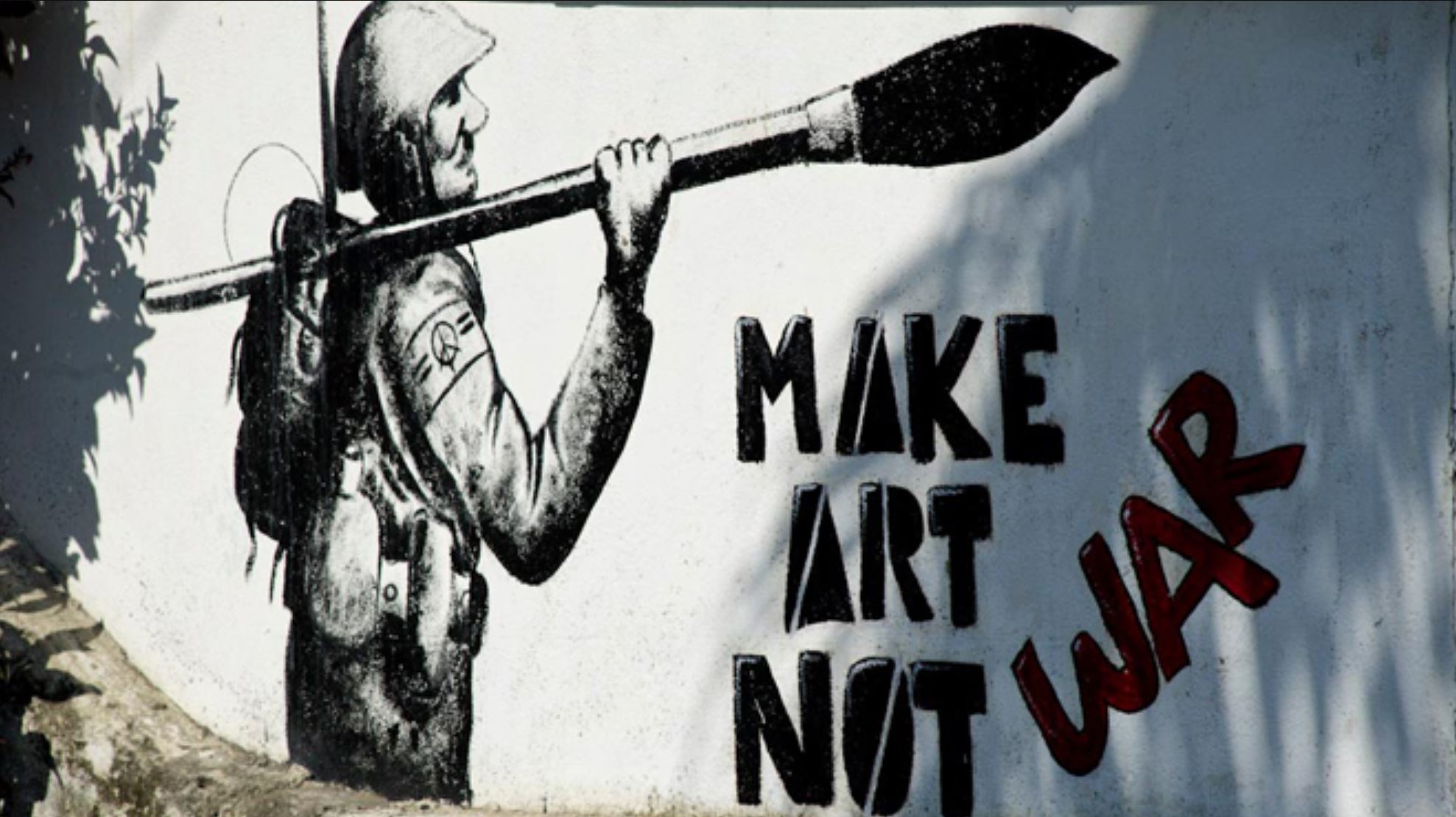
On Saturday (9/14) I very reluctantly visited the Banksy Museum on Canal Street since I was already heading to a dentist appointment three blocks away and knew I wouldn’t make it back to Snug Harbor in time for the Art Lab Open House. I hated the idea of paying $26 ($30 without student discount) for a ticket to an exhibit of replicas of artwork from an artist who is strictly anti-capitalist. This seems to be the majority opinion as the museum was EMPTY except for a family of French tourists. The museum curators seem to be operating on this motto stenciled on the wall:

The museum layout oddly reminded me of an IKEA with blue tape arrows on the floor guiding visitors through a maze of plaster, stucco walls, and brick wallpaper. Of course, the employee at the ticket counter made sure to inform me to follow the blue arrows all the way to the end at which I would find the gift shop (yayy 😑). 

There was an attempt at making each room give off the vibe of the setting in which certain pieces were located, such as with the telephone booth and the vinyl sticker manhole covers in the UK section of the exhibit, but the look didn’t seem to be maintained very well over the past few months that the museum has been open. 

Additionally, the “immersive” experience that the museum advertises is hindered by the yellow-and-black tape on the floor in front of each piece. Street art is made to be exposed to the elements, but here it is protected by a piece of tape that tells the viewer ‘do not touch,’ and creates a facade of this art being expensive and/or exclusive when they are really just replicas printed or painted on wallpaper.

Of course the small French children in the room with me did not seem to care for the tape and went ahead and touched the walls anyways…

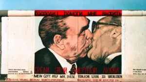
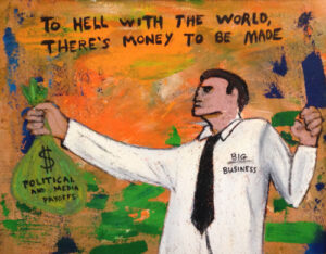
This piece to me stood out as cheaply replicated with its strange spackle texture that is not present in the original (or on any wall; fr whose idea was this??). I like the message conveyed by the artwork, but I think my enjoyment of it visually is affected by this odd texture.

There were also minor spelling/grammatical errors in some of the plaques, such as this misspelling of “Neptune Avenue.”

The entire visit I couldn’t help but feel ashamed that I actually spent $26 on this. For a museum that not only betrays the original intent of the artist, but also profits off of their work. And for a museum that features replicas of Banksy’s many anti-capitalist works, you’d think that they would try to mask the irony better. This piece in particular was comically ironic considering the price shown is the exact same as the standard ticket price for this museum.

Although I left with an overall feeling that I had wasted my time and money, I did enjoy some of the little details such as the small graffiti rats scattered around the museum’s hallways and staircases. I thought they were cute and demonstrated the museum curators taking inspiration from Banksy rather than simply putting replicas up on the wall with a plaque. 

I do have to commend the museum for dedicating a section to Banksy’s work in Palestine and maintaining a sympathetic view of the Palestinian plight. They even recreated a room from The Walled Off Hotel in Bethlehem, which was designed and financed by Banksy and other artists to promote peace in the West Bank. While the real hotel is currently closed due to the escalating conflict, this recreation carries on its original message. I say this about this piece in particular and not other parts of the museum because the hotel room was the most immersive experience out of all the replicas I saw. It was clear that whoever designed this particular part of the exhibit cared that it looked like a real hotel room and that viewers understood Banksy’s intention by having an informational video play in the background as visitors looked around the room.